Cluely — inspected native text, interface layering and short eased transitions. Ovaro uses HTML, SVG and CSS for the controls and monitoring sequence; the section is not a screenshot.
Mochi Health — large treatment imagery and nearby programme information. Ovaro retains its own warm paper, evergreen and source pricing.
W3C carousel guidance — named programme tabs, previous/next controls, explicit pause, keyboard navigation, hidden inactive panels and reduced-motion support.
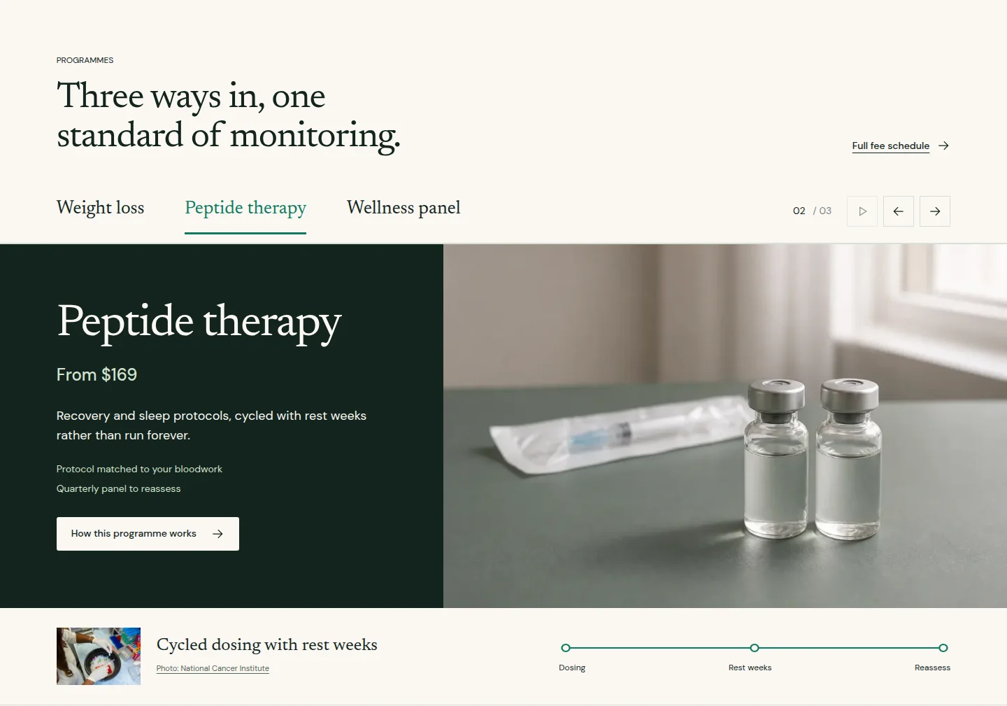
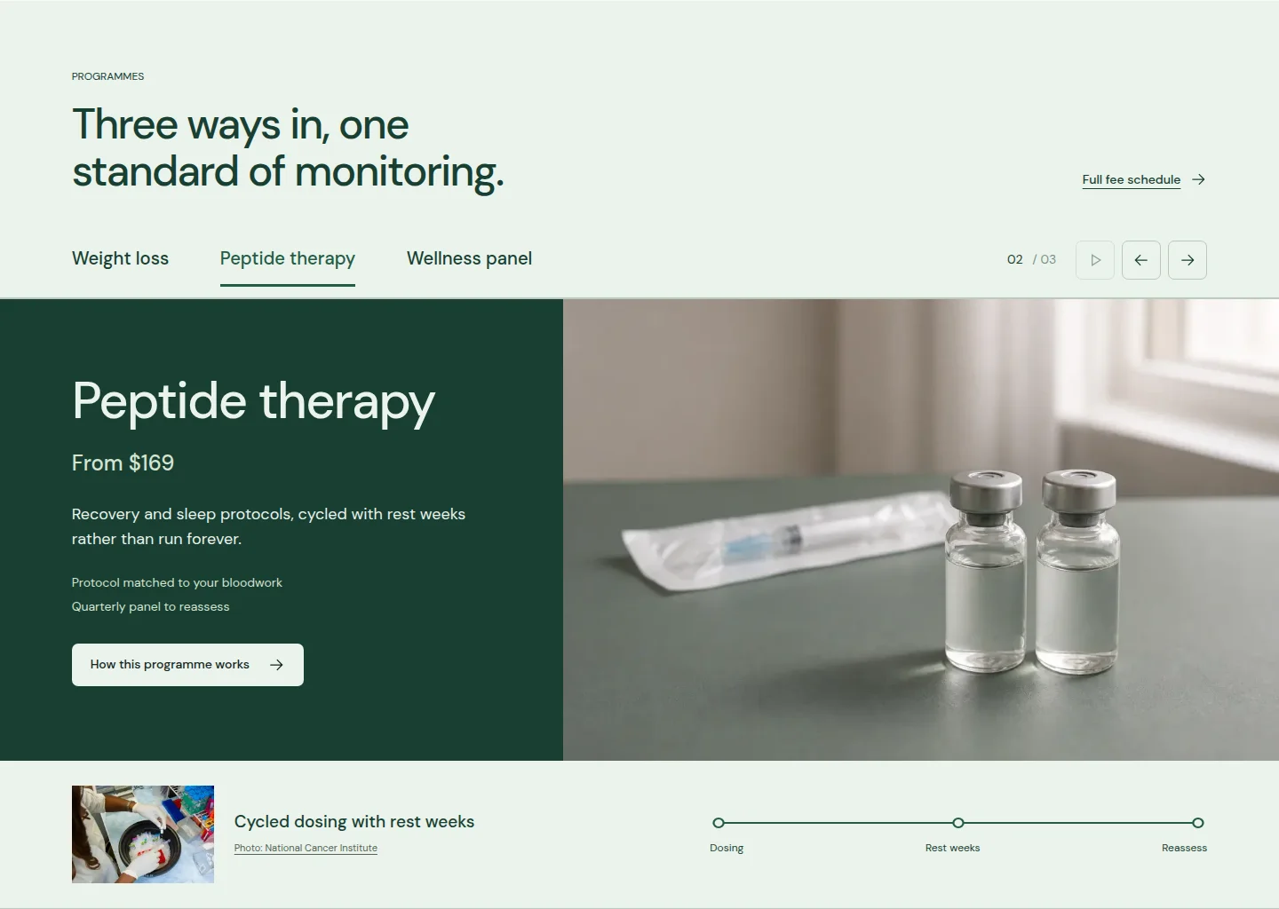
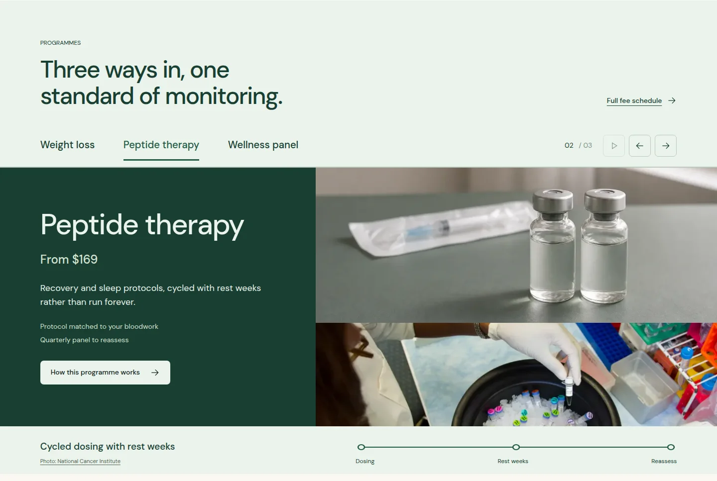
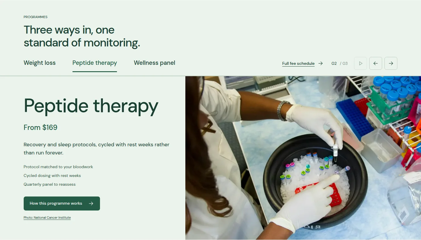
The first generated study felt too much like a checklist. The second evergreen direction was preferred, then revised to use the actual homepage screenshot. Further feedback removed the enclosing stage and inset interface cards. The working version preserves the same imagery and integrates the motion into the open section.
Automatic progression takes ten seconds of visible, uninterrupted reading time. Hovering pauses it; focus, programme selection or interacting with the programme content stops it until Play is chosen. Reduced motion keeps programme selection instant and disables autoplay.