Four directions for the announcement bar, navigation, and hero. The same source wording, with care interfaces built in HTML. Open a direction to compare its composition and mobile layout.
Desktop compositions rendered at 1440px wide. Open a direction to explore the working page.
Sage / human
Hero study
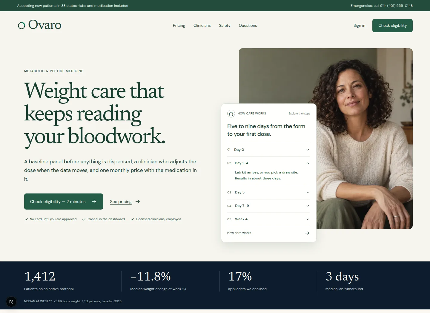
Warm editorial type, daylight portrait, and a care timeline that sits between the person and the practice.
Critique. The strongest continuity with the current brand. The portrait competes with the care panel at smaller desktop sizes; the UI stays deliberately compact.
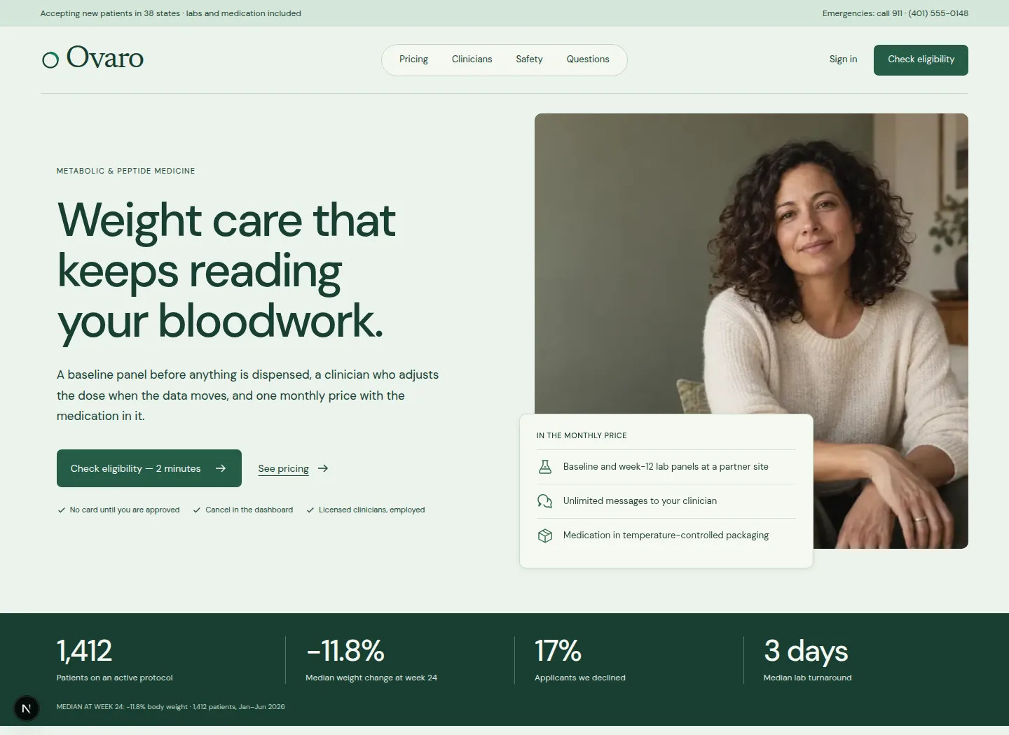
A technology-led headline beside a generous portrait, with a brief native summary of included care.
Critique. Selected direction. The portrait now leads the visual; a short inclusion summary replaces the detailed timeline, which remains farther down the page.
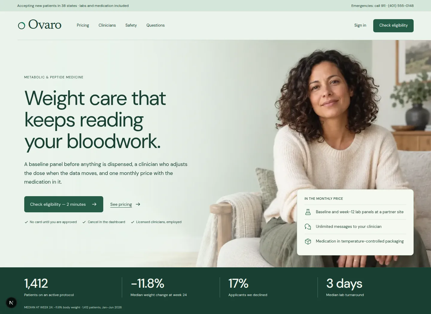
A lighter headline and open navigation above a continuous daylight room, with a separate mobile portrait composition.
Critique. The quieter typography gives the portrait more presence. This is the warmer comparison; Mint / precise keeps a stronger headline, structured split and centred navigation capsule.
Short, silent recordings of the working Mint / precise hero. Play to review its controls and movement, then open the live design to try them yourself.
Desktop · hover, press and focusThe Pricing link responds to hover, the eligibility button depresses on press, and keyboard focus remains visible.Phone · menu and hero entrancesThe navigation opens and closes; scrolling reveals the portrait and brief inclusion summary before returning to the top.
What changed through critique
The first photographic direction was too close to a conventional wellness hero. The second pass uses the supplied care sequence as the interface, preserving the full day ranges and the clinician’s ability to decline or hold a dose. No invented lab measurements, treatment graphs, or patient accounts.
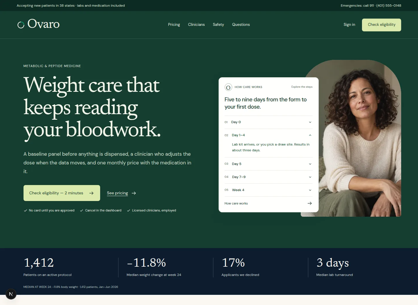
Mint is the selected direction for the next iteration: a more technology-led identity, a stronger portrait, and a brief inclusion summary. The detailed care journey stays farther down the page. Sage preserves the warmer editorial comparison; Forest explores a more formal practice identity. The branding loop remains open.
References
Cluely informed readable interface demonstrations and compact controls. Mochi Health informed an approachable care presentation and a clear announcement-to-action hierarchy.
Search readiness
Headlines and care steps are server-rendered text, with one H1 per page, descriptive metadata, responsive images, local fonts, and crawlable links. These duplicate design studies remain noindex while you choose a direction.